Responsive Website Redesign
San Francisco
Public Library
A refreshed library homepage designed to make books, services, events, and community resources easier to discover across desktop and mobile.
Project Overview
A two-part redesign focused on creating a clear, welcoming homepage for the San Francisco Public Library.
The individual coursework project began with a desktop layout and continued with a phone-sized version. Both designs use the same visual direction while adapting the content structure to each screen.
Project Brief
01 / OBJECTIVERedesign the provided San Francisco Public Library homepage into a clear, welcoming experience for desktop and mobile.
Desktop
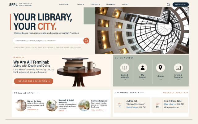
Build a 1280 × 800 px homepage using a 12-column grid, with clear spacing, organized content, and an easy-to-find search experience.
Mobile
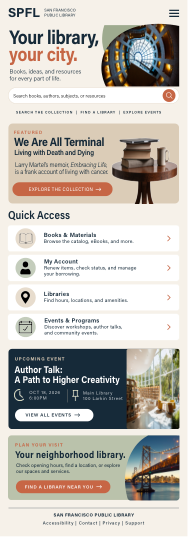
Adapt the same visual direction to a 375 px-wide phone layout, reorganizing the content for a narrow screen rather than simply shrinking the desktop design.
Color Palette
02 / COLORThe designs pair a warm neutral foundation with deep navy typography, terracotta accents, and muted sage panels. The palette and labels below describe the visible design direction in the submitted screens.
Final Design
03 / DESKTOP + MOBILEThe desktop and mobile homepage designs presented together.
Designed for access.
Built for community.
SAN FRANCISCO PUBLIC LIBRARY · WEBSITE REDESIGN